Main menu
Skip to content
Welcome
Figures
All figures
Categorical Data
Distributions
Time Series
Scatter Plots
Maps
Illustrative Examples
Data
Reviews
Errata
Tag Archives:
Data Visualisation
Map of Napoleon’s Russian Campain in 1812/13, by Charles Joseph Minard, 1869
Scatter Plot Gapminder
Nighttime Map of Germany as Scatter Plot
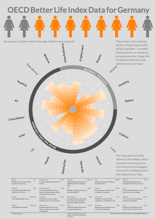
Polar Area Chart (Poster)
Polar Area Charts Without Labels (Panel)
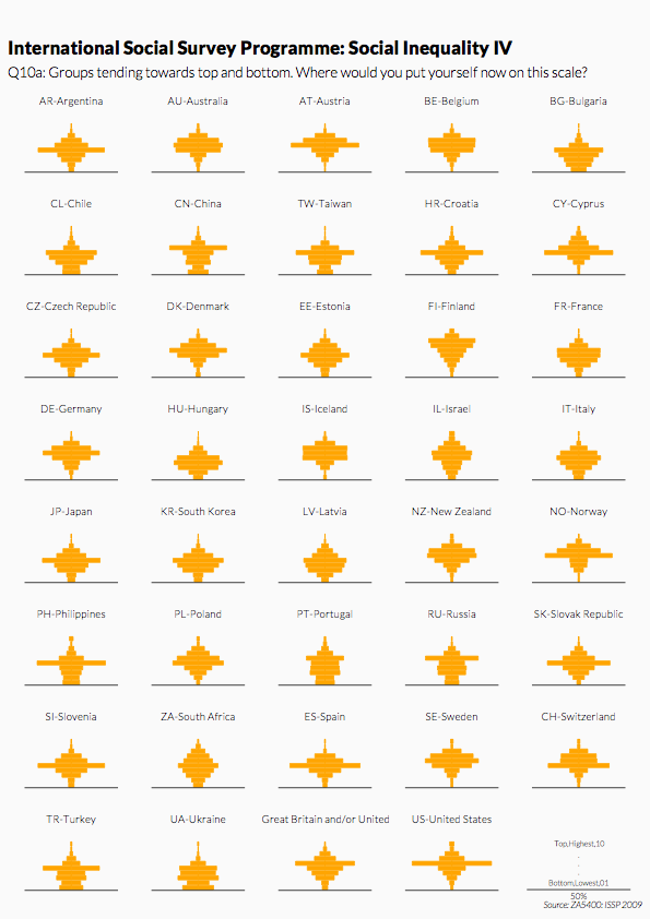
Polar Area Charts with Labels (Panel)
Table with Symbols of the “Symbol Signs” Type Face
City Maps with OpenStreetMap Data (Panel)
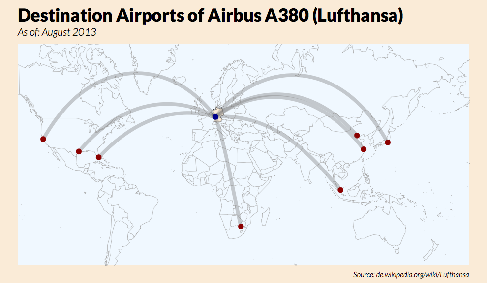
World Map with Orthodromes
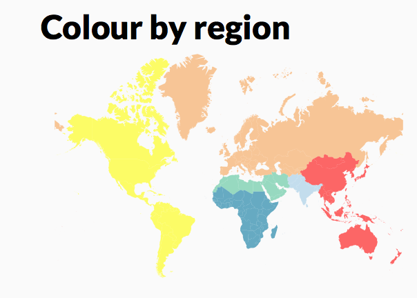
World Choropleth Map: Regions
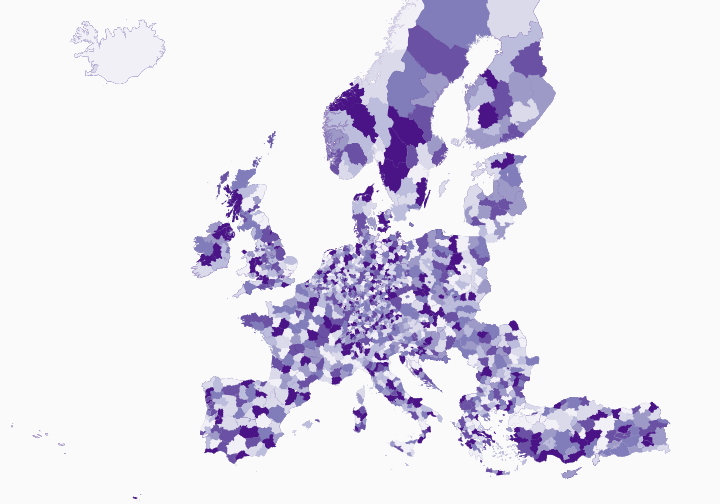
Choropleth Map of Europe at Country-Level (Panel)
Choropleth Map of Europe at Country-Level
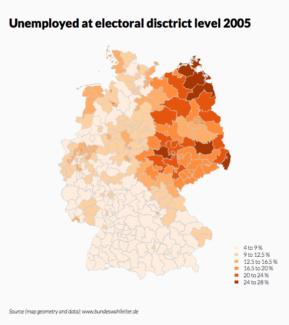
Choropleth Map of Germany at District-Level (Panel)
Choropleth Map of Germany at District-Level
Map of Tunisia with Self-defined Symbols
Map of North Rhine-Westphalia with Selected Locations (Symbols) and Outline
Map of Germany as Three-Dimensional Scatter Plot
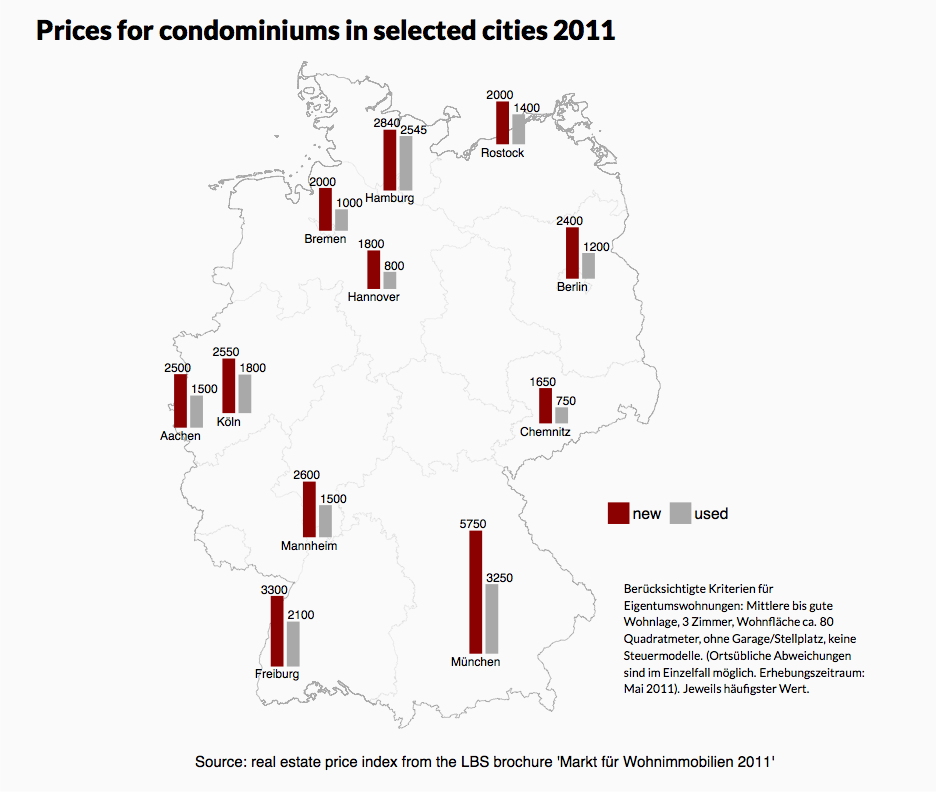
Map of Germany with Selected Locations (Columns) and Outline
Map of Germany with Selected Locations (Pie Charts) and Outline
Map of Germany with Selected Locations and Outline (Panel)
Map of Europe NUTS 2006 (Cut-out)
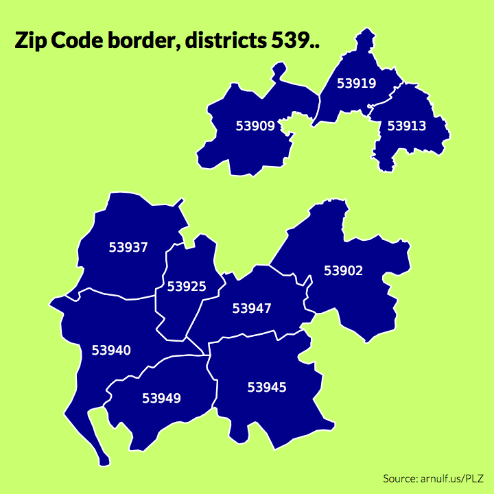
Filtered Postcode Map
Maps of Germany: Local Telephone Areas and Postcode Districts
Map of Germany as Scatter Plot
Scatter Plot With User-Defined Symbols
Scatter Plot with Few Points
Scatter Plot Variant 5: Connected Points
Scatter Plot Variant 4: Superimposed Ellipse
Scatter Plot Variant 3: Areas Highlighted
Scatter Plot Variant 2: Outliers Highlighted
Scatter Plot Variant 1: Four Quadrants Differentiated by Colour
Temporal Ranges
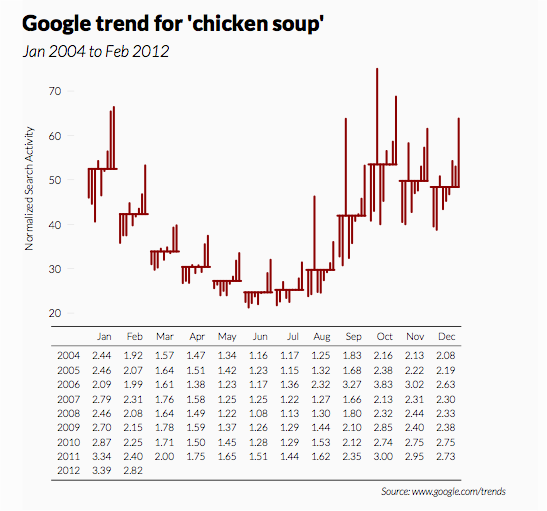
Season Figure (Seasonal Subseries Plot) with Data Table
Seasonal Ranges Stacked
Seasonal Ranges (Panel)
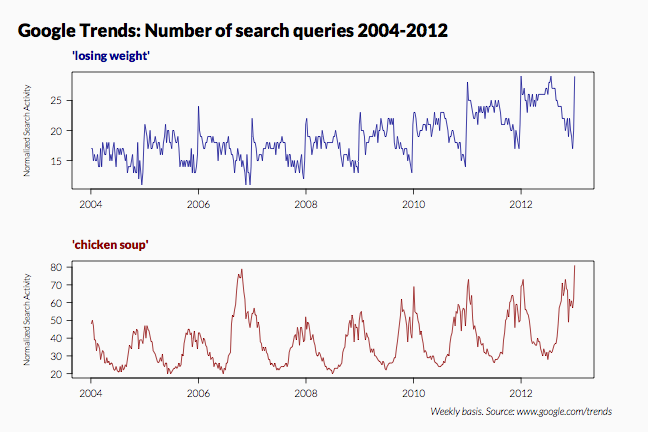
Time Series with Missing Values
Time Series as Scatter Plot (Panel)
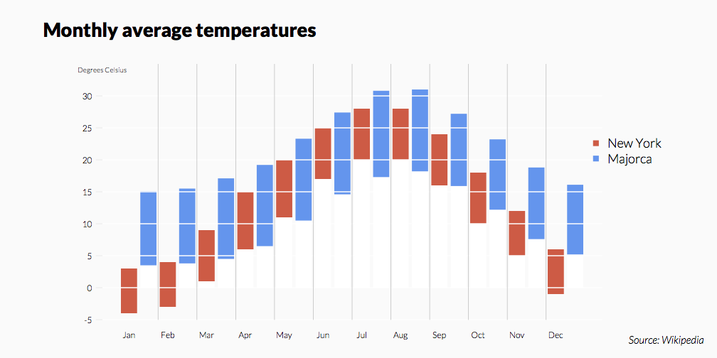
Monthly Values with Monthly Labels (Layout)
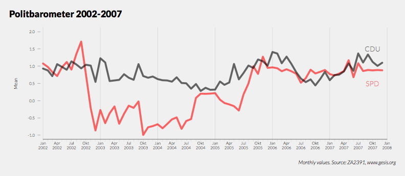
Monthly Values with Monthly Labels
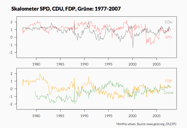
Monthly Values (Panel)
Time Series from Weekly Values (Panel)
Daily Values with Monthly Labels
Daily Values with Labels and Week Symbols (Panel)
Daily Values with Labels
Time Series with Trend (Panel)
Areas Under a Time Series
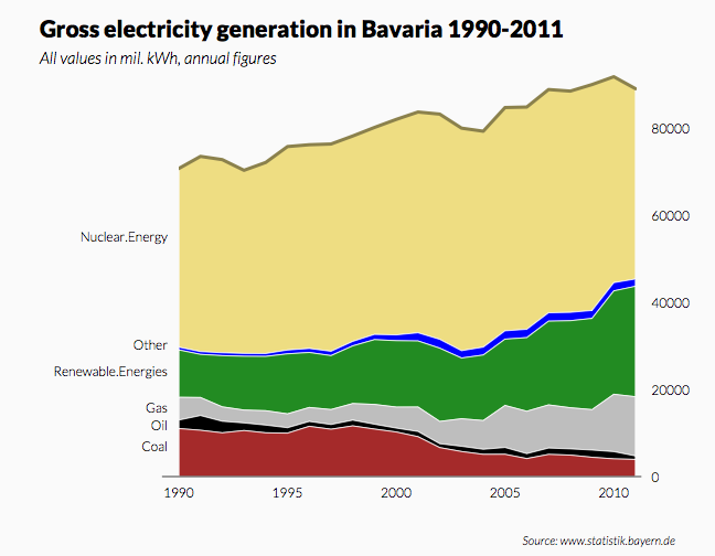
Time Series with Stacked Areas
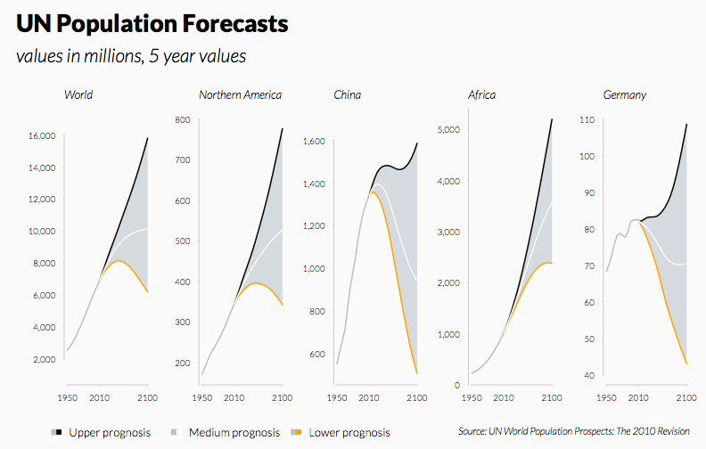
Forecast Intervals Index (Panel)
Forecast Intervals (Panel)
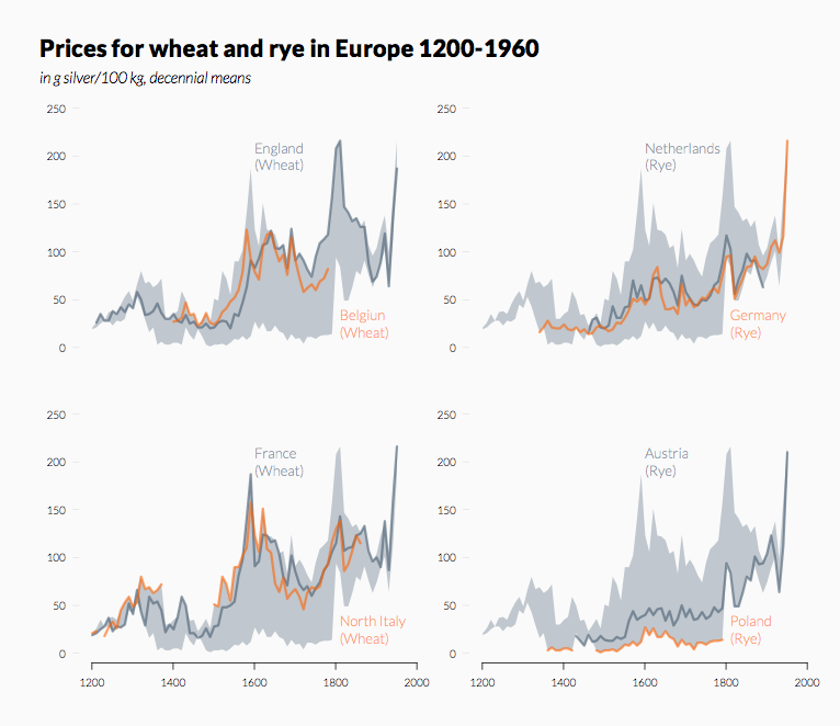
Areas as Corridor with Time Series (Panel)
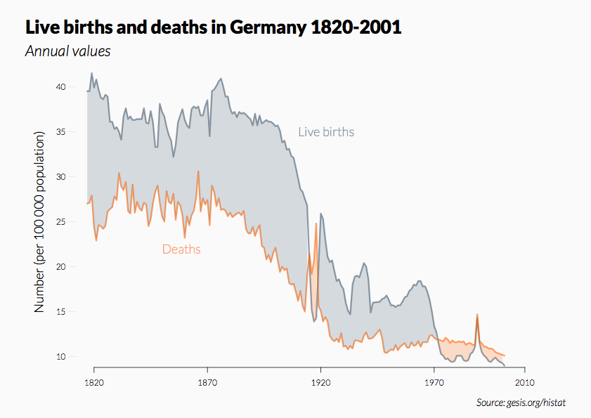
Areas Between Two Time Series
Short Time Series Overlayed
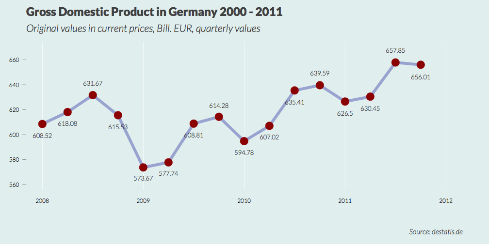
Quarterly Values as Lines with Value Labels
Quarterly Values as Columns
Column Chart with Percentages for Growth Developments
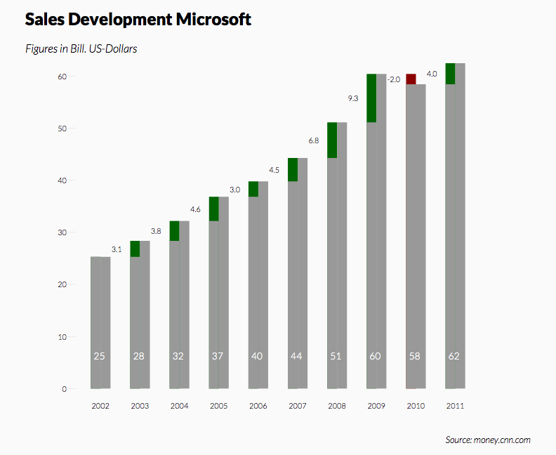
Column Chart for Developments
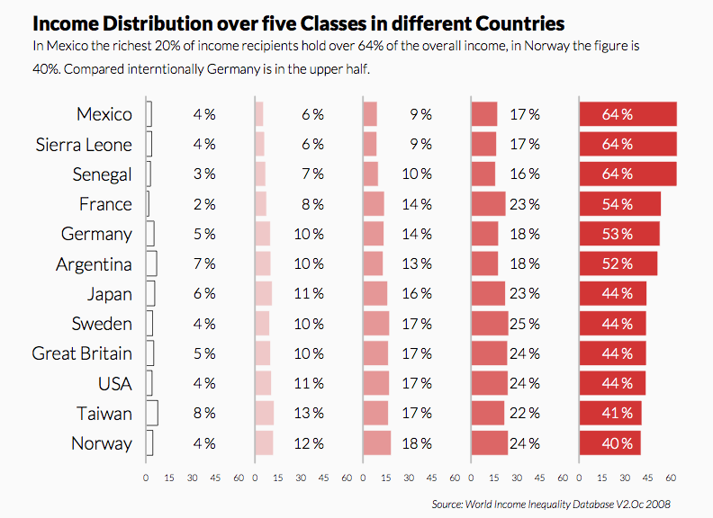
Comparison of Income Proportion with Panel-Bar Chart (Quintile)
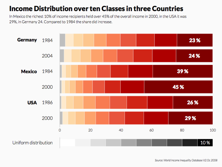
Comparison of Income Proportions with Bar Chart (Decile)
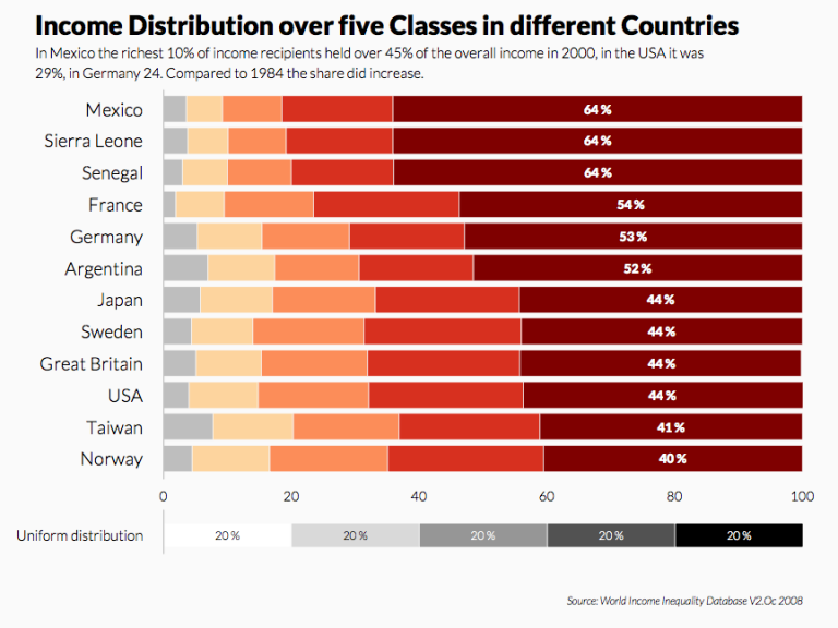
Comparison of Income Proportions with Bar Chart (Quintile)
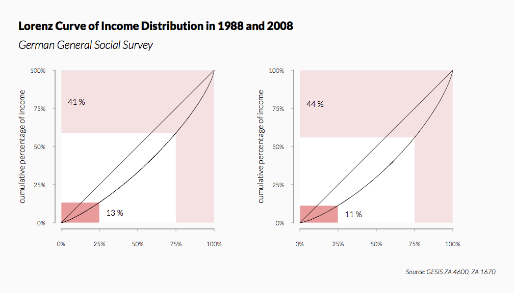
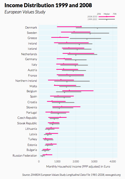
Lorenz Curves (Panel)
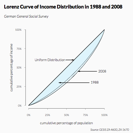
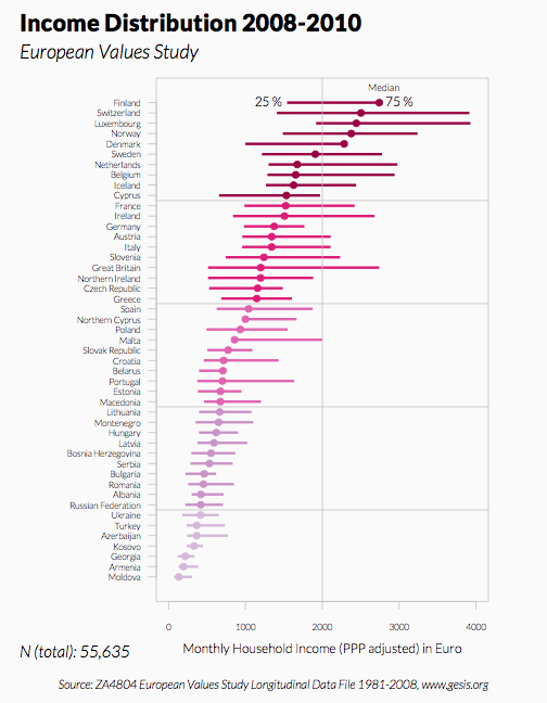
Lorenz Curves Overlay
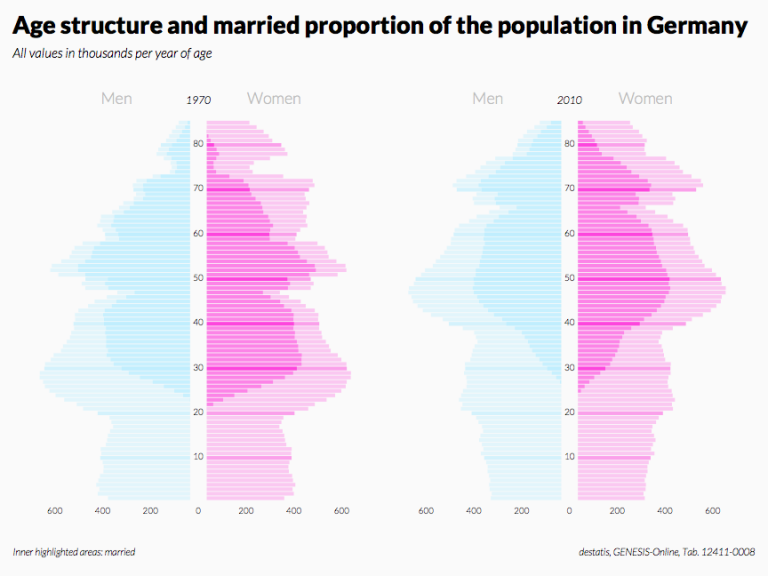
Bar Charts as Pyramids (Panel)
Aggregated Pyramids
Pyramids with Added Line (Panel)
Pyramids – Emphasis on the Inner Areas (Panel)
Pyramids – Emphasis on the Outer Areas (Panel)
Pyramid with Multiple Colours
Box Plots for Groups – Sorted in Descending Order, Comparison of Two Polls
Box Plots for Groups – Sorted in Descending Order
Histograms (Panel)
Column Charts Coloured with ColorBrewer (Panel)
Histograms Overlay
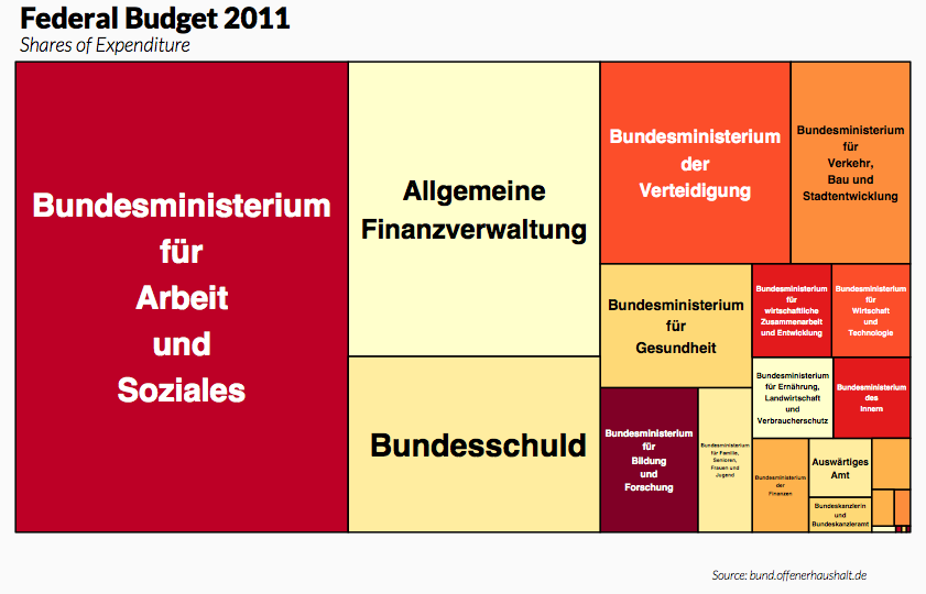
Tree Maps for Two Levels (Panel)
Tree Map
Balloon Plot
Mosaic Plot
Heat Map
Bump Chart
Simplified Gantt Chart – Colours by People
Simplified Gantt Chart
Radial Polygons Overlay
Radial Polygons (Panel) – Different Column Arrangement
Radial Polygons (Panel)
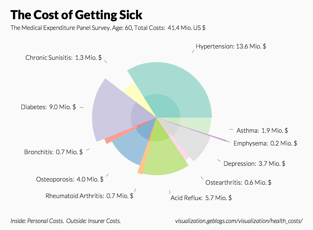
Spie Chart
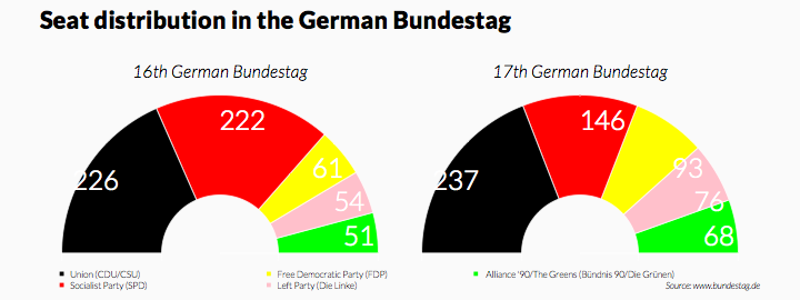
Seat Distribution (Panel)
Pie Charts, Labels Inside (Panel)
Simple Pie Chart
Column Chart with Shares
Dot Chart for Three Variables
Profile Plot for Multiple Response Questions – Mean Values of the Responses
Column Chart with 45-Degree Labelling
Column Chart with Two-Line Labelling
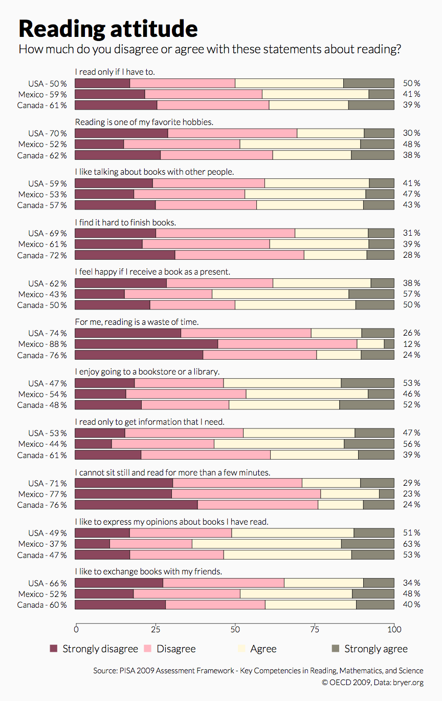
Bar Chart for Multiple Response Questions – All Response Categories, Grouped
Bar Chart for Multiple Response Questions – Symbols for Individuals
Bar Chart for Multiple Response Questions – All Response Categories (Panel)
Bar Chart for Multiple Response Questions – All Response Categories, Variant
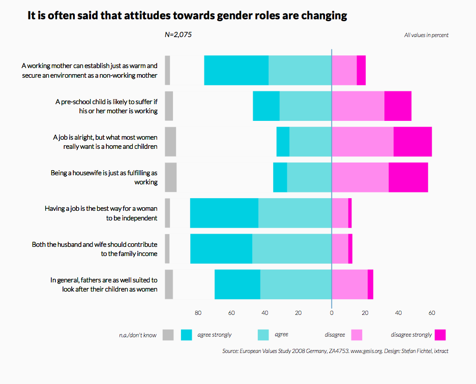
Bar Chart for Multiple Response Questions – All Response Categories
Bar Chart for Multiple Response Questions – First Two Response Categories
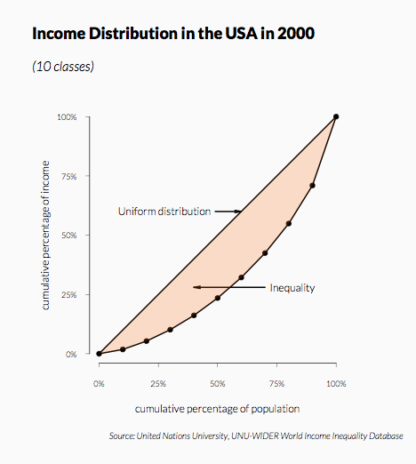
Simple Lorenz Curve
Bar Chart Simple